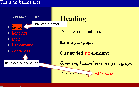
Now we'll create a rollover effect with:
- CSS,
- the anchor element (a; remember, the anchor element creates a link) and
- the anchor's pseudoclass.
What is pseudoclass? Don't worry. We'll get to it. In short it is a state of the link.
The browser's default presentation of a link is blue and underlined. Like the link below.
When you place your mouse over the link, it turns red. This is a pseudoclass also called as a hover state.
You can control how a link is presented in it's two states:
- when the mouse is off and
- when the mouse is over the link
The link syntax for the hover look like this:
Looks like:
a:hover {color:#000000; text-decoration-none }
a is the selector
hover is the pseudoclass
color and text-decoration are the properties.
color has the value#000000.
text-decoration has the value none .
a
The anchor element (a) is used to create a hyperlink.
a:hover
Describes a hyperlink while the user's mouse happens to be hovering over it.
 Steps to Success
- Add the following code to layout.css
a {
color: #FF0000;
text-decoration:none;
}a:hover {
background-color:#ff3300;
color: #000000;
text-decoration:none;
} - Add the following HTML inside the content div of containers.html
<p> This is a link to the <a href="table.html">table page </a></p> - Save and preview in a browser. It should look like this.

Notice:
The links are no longer underlined.
The default for most browsers puts an underline on all links.
In the CSS, we made the text-decoration:none for the a selector.
Make the links a Descendant of the sidenav
All the links look and hover the same way but we want the links in the sidenav area to look and act differently. Our rule should state that only a link that resides in the sidenav div should have this presentation.
- Add the following code to layout.css
This link rule will now be applied to only the descendants of the id selector sidenav
#sidenav a {
color: #00CCFF;
text-decoration:none;
}#sidenav a:hover {
background-color:#00CCFF;
color: #000066;
text-decoration:none;
}
The parent selector is sidenav .
The children selectors are a and a:hover. - Save and preview in a browser. It should look like this.

Notice the links in the sidenav now look and hover differently than the link in the content division. - The bullets are pretty ugly as well. Let's get rid of the bullets in the unordered list in the sidenav.
Add the following code to layout.css
#sidenav ul {
list-style:none;
} - Save and preview in a browser. It should look like this.

- The bullets are pretty ugly as well. Let's get rid of the bullets in the unordered list in the sidenav.
Add the following code to layout.css
#sidenav ul {
list-style:none;
} - Let's just add a couple more rules to the a rule to make it look good.
Add the following code (in red)to layout.css
#sidenav a {
color: #00CCFF;
text-decoration:none;
display:block;
margin-right: 20px;
padding:4px;
} - Save and preview in a browser. It should look like this.

Conclusion
In this step, we have looked at the use of link selectors and we have seen the importance of identifying them within a id selector.
CSS allows us to manipulate the these selectors in a variety of ways. We can change the colour of the text, we can use background-colors and text-decoration, just to name a few of the possibilities that are open to us.
View the page source for this web page and see how we did our side navigation.